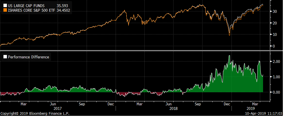
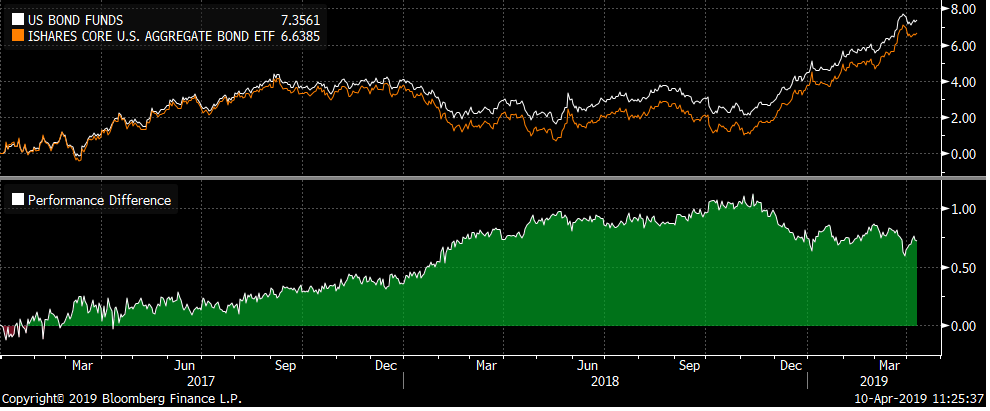
Pete and I created performance charts for our US large cap funds as a group compared to iShares 500 index ETF (IVV) and for Core US Bond funds as a group against the iShares Barclays US Aggregate Bond ETF (AGG). In our quarterly performance presentation we show performance of each vehicle and it was not clear that these funds as a group has performed well.
Here is a chart of performance of our US large cap funds against IVV going back to beginning of 2017:

A few observations from this chart:
1. Performance has been good especially considering only 22% of active managers beat the S&P 500 over the past 3 years.
2. Tracking error prior to the change in funds (9/28/18) was really low and was a main reason for the change
3. The funds as a group picked up 200 bips during the end of year downturn! The larger allocation to low vol has really helped.
I ran the same chart for our active bond managers against AGG – iShares Barclay US Aggregate ETF.

As you can see our collection of active bond managers has added value over iShares US Aggregate ETF.
Hopefully these charts help you explain the positive results to clients!
Thanks,
John

